
REAL ESTATE BRAND & WEBSITE
Armatage Hearth & Home
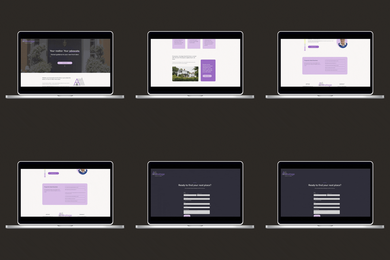
A one-page website and brand guide for a newly licensed Keller Williams agent, named for the South Minneapolis neighborhood she lives in.
CLIENT
Jackie Fendler, Keller Williams
SCOPE
Splash page website, brand guidelines
PLATFORM
Squarespace
TIMELINE
One-week build
SERVICE AREA
South Minneapolis and surrounding cities
A new agent with a real story and no listing yet
THE BRIEF
Where she started
Jackie came to real estate after a career as a clinical social worker. Her only web presence was the standard brokerage page, her network of contacts was small, and she had no listing photos or headshots to show.
She had a business name she loved, a yard sign on order, free dog treat library in the making, and a clear picture of the feeling she wanted: upbeat, colorful, tasteful and a little playful, in blue and lavender.
What the site had to do
Give a first-time visitor a reason to trust her before she has a sales record. Make it easy to reach her without a phone call. Carry the required Keller Williams, MLS and Fair Housing marks without turning the page into a legal notice.
It also had to work as the destination for the QR code on her yard sign, so a neighbor walking by lands somewhere that feels like her.
Warm, polished, and a little bit of fun
DESIGN DECISIONS
Lead with who she is
Her years as a therapist are the differentiator. Listening, kindness and integrity show up in the hero and the About section, and the lender and broker team behind her is named as part of the offer.
Contact form
The main ‘send me a note’ button throughout leads to a short form instead of a phone number, so a visitor who is not ready to call can still reach out. Her phone and email stay visible in the footer.
Welcome everyone
The intro speaks to first-time and seasoned buyers in warm, open language. A rainbow accent carries the welcome visually below as an intentional nod to the LGBTQ+ community
Get a little whimsy
The page stays polished, with the playful moments saved for the bio and one bold color block. Everything else is quiet enough for those two to land.
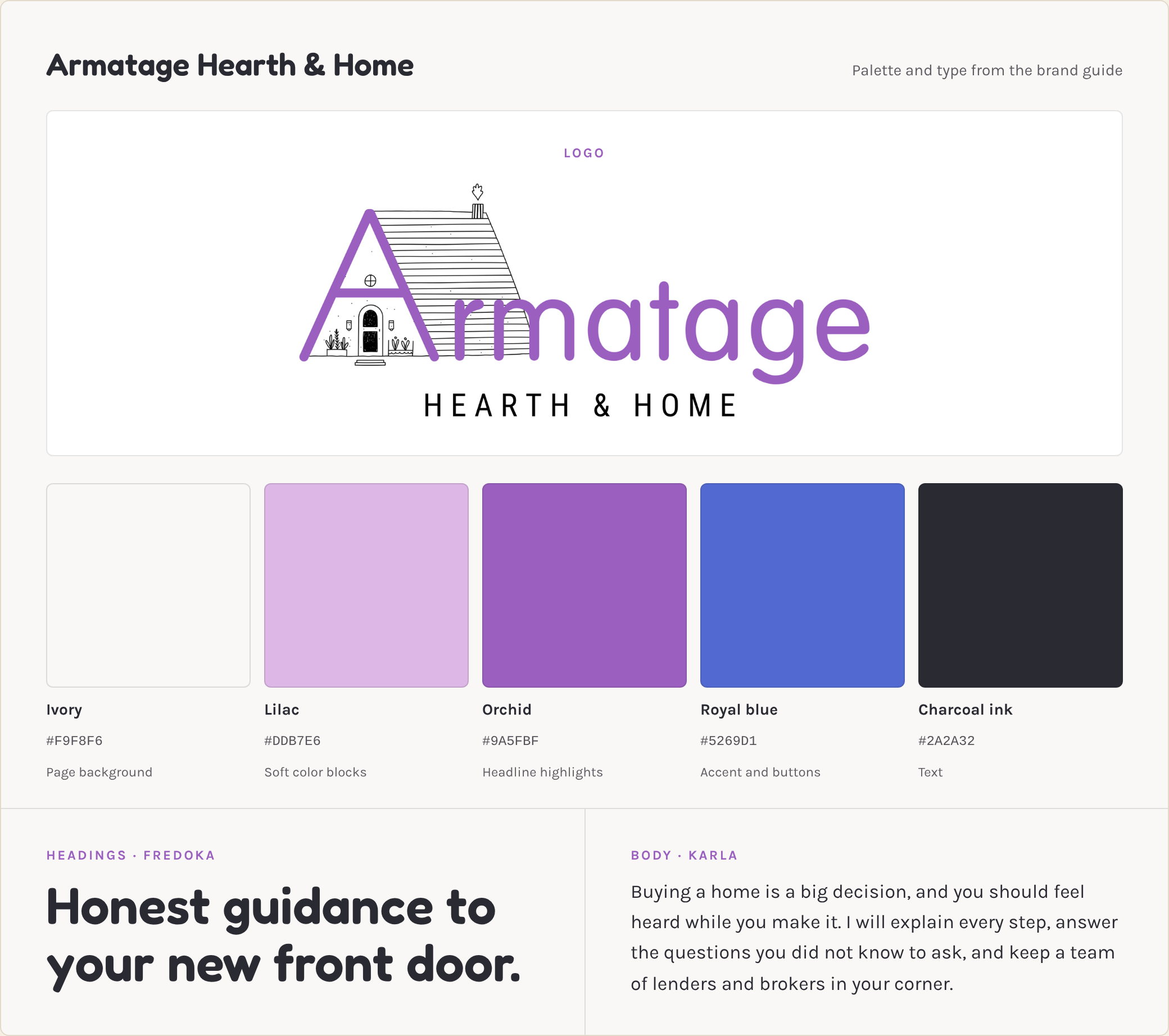
Lavender and blue, kept calm with ivory
BRAND SYSTEM
One page, in the order a visitor thinks and wonders
SITE STRUCTURE
Headline, subhead and the contact form button.
Hero
Buyer types, first-time and seasoned, in warm, open language.
Who I work with
What working with her covers, including the team behind her.
Services
South Minneapolis and surrounding cities, plus a path to browse listings.
Areas I serve
Her path from social work to real estate, in her voice.
About Jackie
Short answers, ending on how and how fast she responds.
FAQs
Contact details and the MLS, Keller Williams and Fair Housing marks.
Footer
The site and the system behind it
WHAT I BUILT
A single, responsive Squarespace page with copy, layout and a lead-capture contact form.
Splash page website
Brand guide
A four-page PDF covering color, typography, and logo usage with do’s and don’ts.
Hero, buyer intro, services, bio and FAQ, written to sound like Jackie, with SEO keywords in mind
Copywriting
Yard sign QR code
A code that opens her website for neighbors and passerbys to learn all about her and setup a call.
Your website should work as hard as you do
I design websites and brands for small businesses, from a single page to a full custom build.