What Every Photographer's Website Needs (and What Most Are Missing)
If you're a photographer, your work is visual by nature — which means your website has one job above all others: get out of the way and let your images do the talking.
But "let the photos shine" is easier said than done. A lot of photographer websites end up either overdesigned (too many templates, animations, and distractions competing with the work) or underbuilt (a basic gallery with no strategy behind it, no path for a visitor to become a client). At Ripple & Rise Studio, we think a photographer's site should do more than display images — it should tell a story, build trust, and quietly convert browsers into booked clients.
Here's what we believe every photographer's website needs, and how we brought that thinking to life for one of our favorite recent projects.
1. A Gallery That Feels Curated, Not Cluttered
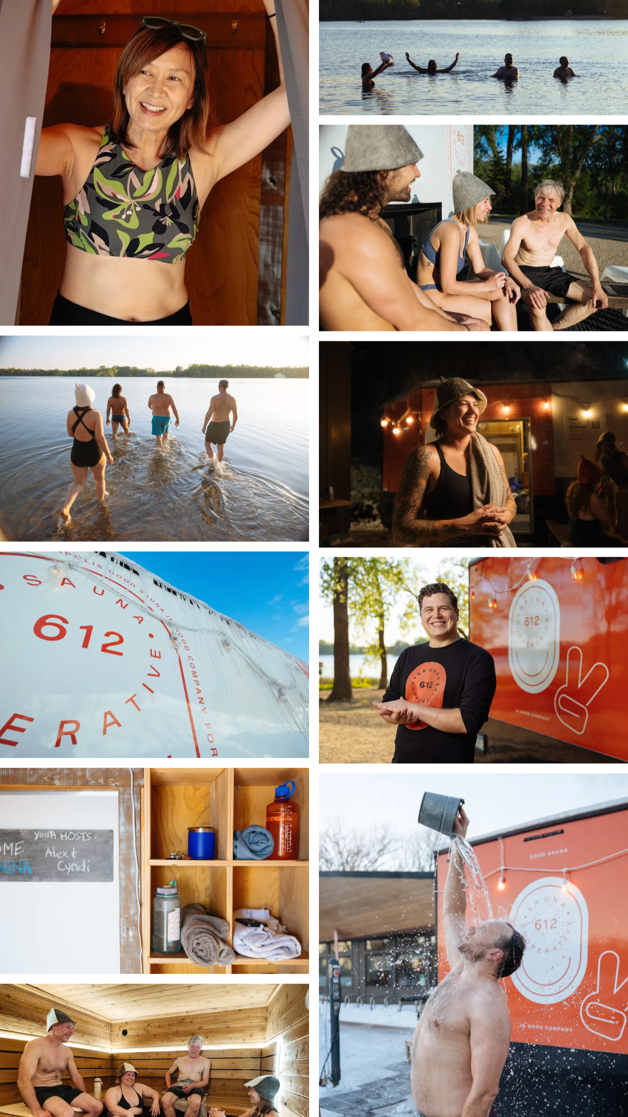
Grid galleries are fine. But a masonry-style layout — where images of varying sizes and orientations flow naturally together — does a much better job of mimicking how a real portfolio feels: intentional, varied, alive. Add subtle hover effects and the gallery starts to feel less like a filing cabinet and more like an experience.
2. A Blog Strategy With a Real Purpose
Most photographers skip blogging altogether, or treat it as an afterthought. That's a missed opportunity on two fronts: SEO and connection. A well-built blog strategy should do double duty — showcasing portfolio work that speaks directly to the type of client you want to attract, while also making room for the personal, behind-the-scenes, passion-project content that makes people feel like they know you before they ever book a session. Consistency matters more than volume here: a steady blogging rhythm keeps a site fresh in the eyes of search engines and gives past and prospective clients a reason to come back.
3. SEO That's Actually Built for Photographers
Photography is a visual-search-heavy, hyper-local, competitive industry. Generic SEO advice doesn't cut it. A photographer's site needs a strategy tailored to their niche — the kind of images, keywords, and content categories that will actually bring the right people to their inbox.
Case Study: Carly Danek Photography
We recently partnered with photographer Carly Danek of Carly Danek Photography to bring this exact philosophy to life. Carly shoots podcasts, storytelling content, and work for NPR — meaning her site needed to represent both technical polish and genuine warmth.
For Carlydanek.com, we built:
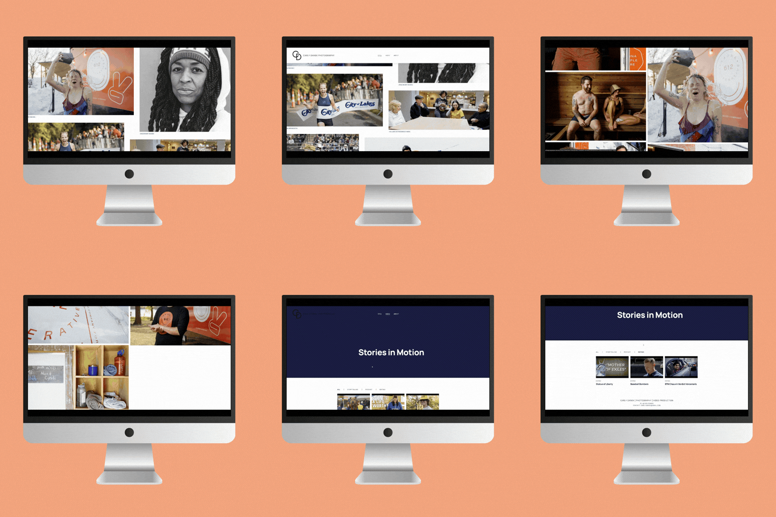
A masonry gallery that lets her varied portfolio — from podcast studios to on-location storytelling shoots — breathe and flow naturally that adds a layer of polish without stealing attention from the images themselves
A new information architecture built around storytelling — rethinking how the site was structured so visitors move through her work the way a story unfolds, including a whole new way of featuring her video content alongside the photography
A blog strategy built for two goals at once: personal and travel content that builds genuine connection, paired with portfolio-driven posts aimed at attracting new types of clients — all backed by a tailored SEO guide to boost her findability.
The result is a site that feels as considered and intentional as Carly's photography itself.
Your Website Should Work as Hard as You Do
Whether you're a photographer, a gym owner, a therapist, a real estate agent, or a landscape designer, the principle is the same: your website shouldn't just sit there looking nice. It should be actively working — building trust, telling your story, and turning visitors into clients.
If you're a photographer thinking it might be time for a website refresh, we'd love to talk.
Ripple & Rise Studio — Minneapolis-based web and UX design for small businesses.